
17 Jan Style Settings
Click button on Top Toolbar and select tab. It contains a lot of style settings grouped by categories.
Global Style Settings
This category contains global parameters of the form:
- Theme. If you don’t have time to customize form style, just load one of existing themes. You can adjust any theme and save it as user theme for later use. You also can import/export any of them to use it with other plugin installation.
- Text style. Adjust the style (font, color, size, etc.) of the text that appears in your form.
- Wrapper background. Adjust the background style of the form. You can use separate settings for inline and for popup modes.
- Wrapper border. Adjust the border style of the form. You can use separate settings for inline and for popup modes.
- Wrapper shadow. Adjust the shadow style of the form. You can use separate settings for inline and for popup modes.
- Padding. Adjust the padding of the form. You can use separate settings for inline and for popup modes.
- Overlay color. Adjust the overlay color when the form is used in popup mode.
- Close icon colors. Adjust colors of the close icon when the form is used in popup mode.
- Spinner colors. Adjust colors of the spinner when the form is used in popup mode.
- Tooltip anchor. Select the anchor for tooltips.
- Tooltip theme. Select the theme of tooltips. This parameter is available if your enabled Tooltipster plugin on General Settings page.
- Form width. Specify the maximum form width and its alignment. Leave this field empty to set maximum form width as 100%.
- Element spacing. Specify the spacing between form elements.
- Responsiveness. At what form width should column layouts be stacked.
Label Style Settings
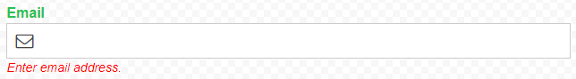
Here you can configure the style of labels and descriptions. To understand what is label and what is description please look at image below. Green text is label, red text is description.
- Label text style. Adjust the style (font, color, size, etc.) of labels. These parameters override “Text style” parameters from “Global Style Settings” category.
- Label position. Specify where to display the label relative to the field.
- Description text style. Adjust the style (font, color, size, etc.) of descriptions. These parameters override “Text style” parameters from “Global Style Settings” category.
- Description position. Specify where to display the description relative to the field.
- “Required” symbol/text position. Select the position of “required” symbol/text. The symbol/text is displayed for fields that are configured as “Required”.
- “Required” symbol/text. The symbol/text is displayed for fields that are configured as “Required”.
- “Required” symbol/text style. Adjust the style (font, color, size, etc.) of “required” symbol/text.
Input Field Style Settings
This category contains parameters to adjust the style of input fields.
- Input size. Choose the size of input fields.
- Icon style. Adjust the style (size, color, position) of input field icons.
- Textarea height. Set the height of textarea fields.
- Input text. Adjust the text style (font, color, size, etc.) of input fields. You can do it for different input states (normal, hover, focus). These parameters override “Text style” parameters from “Global Style Settings” category.
- Input background. Adjust the background style of input fields. You can do it for different input states (normal, hover, focus).
- Input border. Adjust the border style of input fields. You can do it for different input states (normal, hover, focus).
- Input shadow. Adjust the shadow style of input fields. You can do it for different input states (normal, hover, focus).
- Checkbox and radio style. Choose how to display checkbox and radio button fields and their captions.
- Checkbox view. Choose the checkbox view.
- Radio button view. Choose the radio button view.
- Image Select style. Adjust image alignment and effect.
- Image label. Adjust the text style (font, color, size, etc.) of image label. These parameters override “Text style” parameters from “Global Style Settings” category.
- Image border. Adjust the border style of images. You can do it for different states (normal, hover, selected).
- Image shadow. Adjust the shadow style of images. You can do it for different states (normal, hover, selected).
- Multiselect style. Choose how to display multiselect options.
- Tile style. Adjust the tile style.
- Tile text. Adjust the text style (font, color, size, etc.) of tiles. You can do it for different input states (normal, hover, selected). These parameters override “Text style” parameters from “Global Style Settings” category.
- Tile background. Adjust the background style of tiles. You can do it for different input states (normal, hover, selected).
- Tile border. Adjust the border style of tiles. You can do it for different input states (normal, hover, selected).
- Tile shadow. Adjust the shadow style of tiles. You can do it for different input states (normal, hover, selected).
- Range slider skin. Select the skin of range slider. This parameter is available if your enabled Ion.RangeSlider plugin on General Settings page.
- Range slider colors. Adjust colors of range slider. This parameter is available if your enabled Ion.RangeSlider plugin on General Settings page.
Button Style Settings
This category contains parameters to adjust the style of buttons.
- Button style. Adjust the button size and position.
- Button text. Adjust the text style (font, color, size, etc.) of buttons. You can do it for different button states (normal, hover, active). These parameters override “Text style” parameters from “Global Style Settings” category.
- Button background. Adjust the background style of buttons. You can do it for different button states (normal, hover, active).
- Button border. Adjust the border style of buttons. You can do it for different button states (normal, hover, active).
- Button shadow. Adjust the shadow style of buttons. You can do it for different button states (normal, hover, active).
Error Bubble Style Settings
If user submit wrong data through certain input field, the error bubble is displayed for this field. In this category you can configure the view of the bubble.
- Bubble background. Adjust the background of error bubbles.
- Error text style. Adjust the text style (font, color, size, etc.) of errors. These parameters override “Text style” parameters from “Global Style Settings” category.
Progress Bar Settings
In case of using multi-page (multi-step) forms, you can enable progress bar. In this category you can configure the view of the progress bar.
- Enable progress bar. If your form the form has several pages/steps, it is recommended to display progress bar for better user experience.
- Progress style. Select the general view of progress bar.
- Colors. Adjust colors of progress bar.
- Double-tone stripes. Add double-tone diagonal stripes to progress bar.
- Show page name. Show page name.
- Include confirmation page. Consider Confirmation page as part of total pages and include it into progress bar.
- Position. Select the position of progress bar. It can be inside or outside of main form wrapper.
Sorry, the comment form is closed at this time.