Form data submitted by user can be sent to 3rd party services (such as MailChimp, AWeber, GetResponse, etc.). To enable this feature just click button on Top Toolbar, select Integrations tab and create as many integrations as you need. You can customize integrations and use conditional logic.
Important! If you do not see your marketing/CRM provider, make sure that you enabled appropriate integration module on Advanced Settings page.
Plugin has integration modules with following marketing/CRM providers:
- Acelle Mail
- ActiveCampaign
- ActiveTrail
- AgileCRM
- Automizy
- AvangEmail
- AWeber
- Beehiiv
- BirdSend
- Bitrix24
- Campaign Monitor
- CleverReach
- Constant Contact
- Conversio
- Drip
- FluentCRM (available for WordPress plugin only)
- FreshMail
- GetResponse
- HubSpot
- INBOX
- Interspire
- Jetpack Subscriptions (available for WordPress plugin only)
- Klaviyo
- Mad Mimi
- Mailautic
- MailChimp
- MailerLite
- MailFit
- Mailgun
- Mailjet
- Mailmodo
- MailPoet (available for WordPress plugin only)
- Mailster (available for WordPress plugin only)
- MailWizz
- Mautic
- Moosend
- Mumara
- Omnisend
- Ontraport
- Rapidmail
- SalesAutoPilot
- SendFox
- SendGrid
- SendinBlue
- SendPulse
- Sendy
- The Newsletter Plugin (available for WordPress plugin only)
- Tribulant Newsletters (available for WordPress plugin only)
- Your Mailing List Provider
- Zapier
- Zoho CRM
If you don’t see your provider in a list, just drop request and we will add it. 😉
Also plugin has integration modules that allows to:
- Submit form data as a part of 3rd party HTML form.
- Send form data as a custom GET/POST-requests.
- Insert form data into 3rd party MySQL database/table.
- Create new WordPress User (available for WordPress plugin only).
Acelle Mail
To enable integration with Acelle Mail, make sure that you activated appropriate integration module. Go to Advanced Settings page and turn on Activate Acelle Mail Integration module. Then go to form editor, click button on Top Toolbar, select Integrations tab and click Acelle Mail button. New Acelle Mail integration will be added. Click to configure integration.
It has the following parameters:
- Name. The name of the integration. It is used for your convenience.
- Enabled. You can disable this integration by turning this off.
- Execute. You can specify when integration must be executed: after successful form submission, when user confirmed submitted data using double opt-in feature, after successfully completed payment or after non-completed payment.
- API Endpoint. Enter your Acelle Mail API Endpoint. You can get it on API page in your Acelle Mail account.
- API Token. Enter your Acelle Mail API Token. You can get it on API page in your Acelle Mail account.
- List ID. Select list ID where data submitted to.
- Fields. Map form fields to Acelle Mail fields.
- Conditional logic. If enabled, you can create rules to enable this integration depending on the values of input fields.
ActiveCampaign
To enable integration with ActiveCampaign, make sure that you activated appropriate integration module. Go to Advanced Settings page and turn on Activate ActiveCampaign Integration module. Then go to form editor, click button on Top Toolbar, select Integrations tab and click ActiveCampaign button. New ActiveCampaign integration will be added. Click to configure integration.
It has the following parameters:
- Name. The name of the integration. It is used for your convenience.
- Enabled. You can disable this integration by turning this off.
- Execute. You can specify when integration must be executed: after successful form submission, when user confirmed submitted data using double opt-in feature, after successfully completed payment or after non-completed payment.
- API URL. Enter your ActiveCampaign API URL. To get API URL please go to your ActiveCampaign Account >> Settings >> Developer.
- API Key. Enter your ActiveCampaign API Key. To get API Key please go to your ActiveCampaign Account >> Settings >> Developer.
- List ID. Select list ID where data submitted to.
- Fields. Map form fields to ActiveCampaign fields.
- Tags. Enter comma-separated list of tags.
- Conditional logic. If enabled, you can create rules to enable this integration depending on the values of input fields.
ActiveTrail
To enable integration with ActiveTrail, make sure that you activated appropriate integration module. Go to Advanced Settings page and turn on Activate ActiveTrail Integration module. Then go to form editor, click button on Top Toolbar, select Integrations tab and click ActiveTrail button. New ActiveTrail integration will be added. Click to configure integration.
It has the following parameters:
- Name. The name of the integration. It is used for your convenience.
- Enabled. You can disable this integration by turning this off.
- Execute. You can specify when integration must be executed: after successful form submission, when user confirmed submitted data using double opt-in feature, after successfully completed payment or after non-completed payment.
- Access Token. Enter your ActiveTrail Access Token. Create it on Settings page in ActiveTrail account.
- Fields. Map form fields to ActiveTrail fields.
- Groups. Select groups.
- Conditional logic. If enabled, you can create rules to enable this integration depending on the values of input fields.
AgileCRM
To enable integration with AgileCRM, make sure that you activated appropriate integration module. Go to Advanced Settings page and turn on Activate AgileCRM Integration module. Then go to form editor, click button on Top Toolbar, select Integrations tab and click AgileCRM button. New AgileCRM integration will be added. Click to configure integration.
It has the following parameters:
- Name. The name of the integration. It is used for your convenience.
- Enabled. You can disable this integration by turning this off.
- Execute. You can specify when integration must be executed: after successful form submission, when user confirmed submitted data using double opt-in feature, after successfully completed payment or after non-completed payment.
- Site URL. Enter unique website address of your account. Usually it looks like
https://SITE-NAME.agilecrm.com.
- Email. Enter email address of your AgileCRM account (i.e. email address that you used to create AgileCRM account).
- API Key. Enter your AgileCRM REST API Key. Find it in your AgileCRM account, click “Admin Settings” and “Developers & API”.
- Campaign ID. Select Campaign ID where data submitted to.
- System Properties. Map form fields to AgileCRM system properties.
- Custom Properties. Configure AgileCRM custom properties and map form fields to them.
- Tags. If you want to tag contact with tags, drop them here (comma-separated string).
- Conditional logic. If enabled, you can create rules to enable this integration depending on the values of input fields.
Automizy
To enable integration with Automizy, make sure that you activated appropriate integration module. Go to Advanced Settings page and turn on Activate Automizy Integration module. Then go to form editor, click button on Top Toolbar, select Integrations tab and click Automizy button. New Automizy integration will be added. Click to configure integration.
It has the following parameters:
- Name. The name of the integration. It is used for your convenience.
- Enabled. You can disable this integration by turning this off.
- Execute. You can specify when integration must be executed: after successful popup submission, when user confirmed submitted data using double opt-in feature, after successfully completed payment or after non-completed payment.
- API Token. Enter your Automizy API Token. Find it here.
- List ID. Select list ID where data submitted to.
- Fields. Map popup fields to Automizy fields.
- Tags. Comma-separated list of tags.
- Conditional logic. If enabled, you can create rules to enable this integration depending on the values of input fields.
AvangEmail
To enable integration with AvangEmail, make sure that you activated appropriate integration module. Go to Advanced Settings page and turn on Activate AvangEmail Integration module. Then go to form editor, click button on Top Toolbar, select Integrations tab and click AvangEmail button. New AvangEmail integration will be added. Click to configure integration.
It has the following parameters:
- Name. The name of the integration. It is used for your convenience.
- Enabled. You can disable this integration by turning this off.
- Execute. You can specify when integration must be executed: after successful form submission, when user confirmed submitted data using double opt-in feature, after successfully completed payment or after non-completed payment.
- Public Key. Enter your AvangEmail API Public Key. Find it here.
- Private Key. Enter your AvangEmail API Private Key. Find it here.
- List ID. Select list ID where data submitted to.
- Fields. Map form fields to AvangEmail fields.
- Conditional logic. If enabled, you can create rules to enable this integration depending on the values of input fields.
AWeber
To enable integration with AWeber, make sure that you activated appropriate integration module. Go to Advanced Settings page and turn on Activate AWeber Integration module. Then go to General Settings page, find AWeber Connection section and connect plugin to your AWeber account. After successful connection go to form editor, click button on Top Toolbar, select Integrations tab and click AWeber button. New AWeber integration will be added. Click to configure integration.
It has the following parameters:
- Name. The name of the integration. It is used for your convenience.
- Enabled. You can disable this integration by turning this off.
- Execute. You can specify when integration must be executed: after successful form submission, when user confirmed submitted data using double opt-in feature, after successfully completed payment or after non-completed payment.
- List ID. Select list ID where data submitted to.
- Fields. Map form fields to AWeber fields.
- Tags. Enter comma-separated list of tags applied to the contact.
- Notes. Enter notes applied to the contact (max 60 sybmols).
- Ad Tracking. Enter your Ad Tracking info applied to the contact.
- Conditional logic. If enabled, you can create rules to enable this integration depending on the values of input fields.
Beehiiv
To enable integration with Beehiiv, make sure that you activated appropriate integration module. Go to Advanced Settings page and turn on Activate Beehiiv Integration module. Then go to popup editor, click button on Top Toolbar, select Integrations tab and click Beehiiv button. New Beehiiv integration will be added. Click to configure integration.
It has the following parameters:
- Name. The name of the integration. It is used for your convenience.
- Enabled. You can disable this integration by turning this off.
- Execute. You can specify when integration must be executed: after successful popup submission, when user confirmed submitted data using double opt-in feature, after successfully completed payment or after non-completed payment.
- API Key V2. Enter your Beehiiv API Key. Find it here.
- Publication ID. Select Publication ID where data submitted to.
- Fields. Map popup fields to AvangEmail fields.
- Conditional logic. If enabled, you can create rules to enable this integration depending on the values of input fields.
BirdSend
To enable integration with BirdSend, make sure that you activated appropriate integration module. Go to Advanced Settings page and turn on Activate BirdSend Integration module. Then go to form editor, click button on Top Toolbar, select Integrations tab and click BirdSend button. New BirdSend integration will be added. Click to configure integration.
Important! Please go to your BirdSend Account >> Settings >> Integrations >> BirdSend Apps and create new App. After that go to Permissions tab of App settings and set them as “Write”. Then go to Access Token tab of App settings and create Personal Access Token. Copy and Paste it into relevant field below.
It has the following parameters:
- Name. The name of the integration. It is used for your convenience.
- Enabled. You can disable this integration by turning this off.
- Execute. You can specify when integration must be executed: after successful form submission, when user confirmed submitted data using double opt-in feature, after successfully completed payment or after non-completed payment.
- Personal Access Token. Paste your Personal Access Token with “write” permissions.
- Sequence ID. Select sequence ID where data submitted to.
- Fields. Map form fields to BirdSend fields.
- Tags. Comma-separated list of tags.
- Conditional logic. If enabled, you can create rules to enable this integration depending on the values of input fields.
Bitrix24
To enable integration with Bitrix24, make sure that you activated appropriate integration module. Go to Advanced Settings page and turn on Activate Bitrix24 Integration module. Then go to form editor, click button on Top Toolbar, select Integrations tab and click Bitrix24 button. New Bitrix24 integration will be added. Click to configure integration.
Important! Please go to your Bitrix24 Account >> Applications >> Webhooks and create Inbound webhook with CRM access permissions. Copy and Paste it into relevant field below.
It has the following parameters:
- Name. The name of the integration. It is used for your convenience.
- Enabled. You can disable this integration by turning this off.
- Execute. You can specify when integration must be executed: after successful form submission, when user confirmed submitted data using double opt-in feature, after successfully completed payment or after non-completed payment.
- REST call example URL. Paste REST call example URL created earlier in your Bitrix24 account.
- Fields. Map form fields to Bitrix24 fields.
- Conditional logic. If enabled, you can create rules to enable this integration depending on the values of input fields.
Campaign Monitor
To enable integration with Campaign Monitor, make sure that you activated appropriate integration module. Go to Advanced Settings page and turn on Activate Campaign Monitor Integration module. Then go to form editor, click button on Top Toolbar, select Integrations tab and click Campaign Monitor button. New Campaign Monitor integration will be added. Click to configure integration.
It has the following parameters:
- Name. The name of the integration. It is used for your convenience.
- Enabled. You can disable this integration by turning this off.
- Execute. You can specify when integration must be executed: after successful form submission, when user confirmed submitted data using double opt-in feature, after successfully completed payment or after non-completed payment.
- API Key. Enter your Campaign Monitor API Key. Find Campaign Monitor API Key on Account Settings page when logged into your Campaign Monitor account.
- Client ID. Select Client ID.
- List ID. Select list ID where data submitted to.
- Fields. Map form fields to Campaign Monitor fields.
- Conditional logic. If enabled, you can create rules to enable this integration depending on the values of input fields.
CleverReach
To enable integration with CleverReach, make sure that you activated appropriate integration module. Go to Advanced Settings page and turn on Activate CleverReach Integration module. Then go to form editor, click button on Top Toolbar, select Integrations tab and click CleverReach button. New CleverReach integration will be added. Click to configure integration.
It has the following parameters:
- Name. The name of the integration. It is used for your convenience.
- Enabled. You can disable this integration by turning this off.
- Execute. You can specify when integration must be executed: after successful form submission, when user confirmed submitted data using double opt-in feature, after successfully completed payment or after non-completed payment.
- Client ID. Enter Client ID of your OAuth App. Please go to CleverReach account >> My Account >> Extras >> REST API and click “Create OAuth”. After that click created app and find Client ID there.
- Client Secret. Enter Client Secret of your OAuth App. Find it the same way as Client ID.
- List ID. Select list ID where data submitted to.
- Fields. Map form fields to CleverReach fields.
- Tags. Comma-separated list of tags.
- Conditional logic. If enabled, you can create rules to enable this integration depending on the values of input fields.
To enable integration with Constant Contact, make sure that you activated appropriate integration module. Go to Advanced Settings page and turn on Activate Constant Contact Integration module. Then go to form editor, click button on Top Toolbar, select Integrations tab and click Constant Contact button. New Constant Contact integration will be added. Click to configure integration.
It has the following parameters:
- Name. The name of the integration. It is used for your convenience.
- Enabled. You can disable this integration by turning this off.
- Execute. You can specify when integration must be executed: after successful popup submission, when user confirmed submitted data using double opt-in feature, after successfully completed payment or after non-completed payment.
- API Key. Enter API Key.
- Access Token. Enter your Access Token.
- List ID. Select list ID where data submitted to.
- Fields. Map form fields to Constant Contact fields.
- Conditional logic. If enabled, you can create rules to enable this integration depending on the values of input fields.
Conversio
To enable integration with Conversio, make sure that you activated appropriate integration module. Go to Advanced Settings page and turn on Activate Conversio Integration module. Then go to form editor, click button on Top Toolbar, select Integrations tab and click Conversio button. New Conversio integration will be added. Click to configure integration.
It has the following parameters:
- Name. The name of the integration. It is used for your convenience.
- Enabled. You can disable this integration by turning this off.
- Execute. You can specify when integration must be executed: after successful form submission, when user confirmed submitted data using double opt-in feature, after successfully completed payment or after non-completed payment.
- API Key. Enter your Conversio API Key. Find Conversio API Key on Profile page.
- List ID. Select list ID where data submitted to.
- Fields. Map form fields to Conversio fields.
- Opt-In Text. What opt-in text was shown to the subscriber. This is required for GDPR compliance.
- Conditional logic. If enabled, you can create rules to enable this integration depending on the values of input fields.
Drip
To enable integration with Drip, make sure that you activated appropriate integration module. Go to Advanced Settings page and turn on Activate Drip Integration module. Then go to form editor, click button on Top Toolbar, select Integrations tab and click Drip button. New Drip integration will be added. Click to configure integration.
It has the following parameters:
- Name. The name of the integration. It is used for your convenience.
- Enabled. You can disable this integration by turning this off.
- Execute. You can specify when integration must be executed: after successful form submission, when user confirmed submitted data using double opt-in feature, after successfully completed payment or after non-completed payment.
- API Token. Enter your Drip API Token. Find it on this page.
- Account ID. Select Account ID.
- Campaign ID. Select Campaign ID where data submitted to.
- Fields. Map form fields to Drip fields.
- Custom Fields. Map form fields to Drip custom fields.
- EU Consent. Specify whether the subscriber granted or denied GDPR consent. You can use field shortcode to associate EU Consent field with the form field.
- Tags. Specify comma-separated list of tags that applies to subscribers.
- Conditional logic. If enabled, you can create rules to enable this integration depending on the values of input fields.
FluentCRM
Important! Make sure that you installed and activated FluentCRM plugin.
To enable integration with FluentCRM, make sure that you activated appropriate integration module. Go to Advanced Settings page and turn on Activate FluentCRM Integration module. Then go to form editor, click button on Top Toolbar, select Integrations tab and click FluentCRM button. New Mailster integration will be added. Click to configure integration.
It has the following parameters:
- Name. The name of the integration. It is used for your convenience.
- Enabled. You can disable this integration by turning this off.
- Execute. You can specify when integration must be executed: after successful form submission, when user confirmed submitted data using double opt-in feature, after successfully completed payment or after non-completed payment.
- Lists. Select lists where data submitted to.
- Tags. Select tags.
- Fields. Map form fields to FluentCRM fields.
- Double opt-in. Control whether a double opt-in confirmation message is sent.
- Conditional logic. If enabled, you can create rules to enable this integration depending on the values of input fields.
FreshMail
To enable integration with FreshMail, make sure that you activated appropriate integration module. Go to Advanced Settings page and turn on Activate FreshMail Integration module. Then go to form editor, click button on Top Toolbar, select Integrations tab and click FreshMail button. New FreshMail integration will be added. Click to configure integration.
It has the following parameters:
- Name. The name of the integration. It is used for your convenience.
- Enabled. You can disable this integration by turning this off.
- Execute. You can specify when integration must be executed: after successful form submission, when user confirmed submitted data using double opt-in feature, after successfully completed payment or after non-completed payment.
- API Key. Enter your FreshMail API Key. Find it on Integration page in FreshMail dashboard.
- API Secret. Enter your FreshMail API Secret. Find it on Integration page in FreshMail dashboard.
- List ID. Select List ID where data submitted to.
- Fields. Map form fields to FreshMail fields.
- Conditional logic. If enabled, you can create rules to enable this integration depending on the values of input fields.
GetResponse
To enable integration with GetResponse, make sure that you activated appropriate integration module. Go to Advanced Settings page and turn on Activate GetResponse Integration module. Then go to form editor, click button on Top Toolbar, select Integrations tab and click GetResponse button. New GetResponse integration will be added. Click to configure integration.
It has the following parameters:
- Name. The name of the integration. It is used for your convenience.
- Enabled. You can disable this integration by turning this off.
- Execute. You can specify when integration must be executed: after successful form submission, when user confirmed submitted data using double opt-in feature, after successfully completed payment or after non-completed payment.
- API Key. Enter your GetResponse API Key. Find it here.
- Campaign ID. Select Campaign ID where data submitted to.
- Fields. Map form fields to GetResponse fields.
- Conditional logic. If enabled, you can create rules to enable this integration depending on the values of input fields.
HubSpot
To enable integration with HubSpot, make sure that you activated appropriate integration module. Go to Advanced Settings page and turn on Activate HubSpot Integration module. Then go to form editor, click button on Top Toolbar, select Integrations tab and click HubSpot button. New HubSpot integration will be added. Click to configure integration.
It has the following parameters:
- Name. The name of the integration. It is used for your convenience.
- Enabled. You can disable this integration by turning this off.
- Execute. You can specify when integration must be executed: after successful form submission, when user confirmed submitted data using double opt-in feature, after successfully completed payment or after non-completed payment.
- API Key. Enter your HubSpot API Key. Go to “Integrations >> API key” in your HubSpot account and click “Generate API key”.
- List ID. Select List ID where data submitted to.
- Fields. Map form fields to HubSpot fields.
- Conditional logic. If enabled, you can create rules to enable this integration depending on the values of input fields.
INBOX
To enable integration with INBOX, make sure that you activated appropriate integration module. Go to Advanced Settings page and turn on Activate INBOX Integration module. Then go to form editor, click button on Top Toolbar, select Integrations tab and click INBOX button. New INBOX integration will be added. Click to configure integration.
It has the following parameters:
- Name. The name of the integration. It is used for your convenience.
- Enabled. You can disable this integration by turning this off.
- Execute. You can specify when integration must be executed: after successful form submission, when user confirmed submitted data using double opt-in feature, after successfully completed payment or after non-completed payment.
- API Key. Enter your INBOX API Key. Find it here.
- List ID. Select list ID where data submitted to.
- Fields. Map form fields to INBOX fields.
- Conditional logic. If enabled, you can create rules to enable this integration depending on the values of input fields.
Interspire
To enable integration with Interspire, make sure that you activated appropriate integration module. Go to Advanced Settings page and turn on Activate Interspire Integration module. Then go to popup editor, click button on Top Toolbar, select Integrations tab and click Interspire button. New Interspire integration will be added. Click to configure integration.
It has the following parameters:
- Name. The name of the integration. It is used for your convenience.
- Enabled. You can disable this integration by turning this off.
- Execute. You can specify when integration must be executed: after successful popup submission, when user confirmed submitted data using double opt-in feature, after successfully completed payment or after non-completed payment.
- XML Path. Enter your Interspire XML Path. You can find it in Advanced User Settings.
- XML Username. Enter your Interspire XML Username. You can find it in Advanced User Settings.
- XML Token. Enter your Interspire XML Token. You can find it in Advanced User Settings.
- List ID. Select list ID where data submitted to.
- Fields. Map popup fields to Interspire fields.
- Conditional logic. If enabled, you can create rules to enable this integration depending on the values of input fields.
Jetpack Subscriptions
Important! Make sure that you installed and activated Jetpack plugin.
To enable integration with Jetpack Subscriptions, make sure that you activated appropriate integration module. Go to Advanced Settings page and turn on Activate Jetpack Subscriptions Integration module. Then go to form editor, click button on Top Toolbar, select Integrations tab and click Jetpack Subscriptions button. New Jetpack Subscriptions integration will be added. Click to configure integration.
It has the following parameters:
- Name. The name of the integration. It is used for your convenience.
- Enabled. You can disable this integration by turning this off.
- Execute. You can specify when integration must be executed: after successful form submission, when user confirmed submitted data using double opt-in feature, after successfully completed payment or after non-completed payment.
- Fields. Map certain form field to Jetpack email field.
- Conditional logic. If enabled, you can create rules to enable this integration depending on the values of input fields.
Klaviyo
To enable integration with Klaviyo, make sure that you activated appropriate integration module. Go to Advanced Settings page and turn on Activate Klaviyo Integration module. Then go to form editor, click button on Top Toolbar, select Integrations tab and click Klaviyo button. New Klaviyo integration will be added. Click to configure integration.
It has the following parameters:
- Name. The name of the integration. It is used for your convenience.
- Enabled. You can disable this integration by turning this off.
- Execute. You can specify when integration must be executed: after successful form submission, when user confirmed submitted data using double opt-in feature, after successfully completed payment or after non-completed payment.
- API Key. Enter your Klaviyo Private API Key. Find Private API Key on API Keys page.
- List ID. Select list ID where data submitted to.
- Fields. Map form fields to Klaviyo fields.
- Custom Properties. Map form fields to Klaviyo custom properties.
- Double opt-in. Control whether a double opt-in confirmation message is sent.
- Conditional logic. If enabled, you can create rules to enable this integration depending on the values of input fields.
Mad Mimi
To enable integration with Mad Mimi, make sure that you activated appropriate integration module. Go to Advanced Settings page and turn on Activate Mad Mimi Integration module. Then go to form editor, click button on Top Toolbar, select Integrations tab and click Mad Mimi button. New Mad Mimi integration will be added. Click to configure integration.
It has the following parameters:
- Name. The name of the integration. It is used for your convenience.
- Enabled. You can disable this integration by turning this off.
- Execute. You can specify when integration must be executed: after successful form submission, when user confirmed submitted data using double opt-in feature, after successfully completed payment or after non-completed payment.
- Username. Enter Mad Mimi username or email.
- API Key. Enter Mad Mimi API Key. Find it on Account page (right side column) in your Mad Mimi account.
- List ID. Select List ID where data submitted to.
- Fields. Map form fields to Mad Mimi fields.
- Custom Fields. Map form fields to Mad Mimi custom fields.
- Conditional logic. If enabled, you can create rules to enable this integration depending on the values of input fields.
Mailautic
To enable integration with Mailautic, make sure that you activated appropriate integration module. Go to Advanced Settings page and turn on Activate Mailautic Integration module. Then go to form editor, click button on Top Toolbar, select Integrations tab and click Mailautic button. New Mailautic integration will be added. Click to configure integration.
It has the following parameters:
- Name. The name of the integration. It is used for your convenience.
- Enabled. You can disable this integration by turning this off.
- Execute. You can specify when integration must be executed: after successful form submission, when user confirmed submitted data using double opt-in feature, after successfully completed payment or after non-completed payment.
- Public Key. Enter your Mailautic API Public Key. Find it here.
- Private Key. Enter your Mailautic API Private Key. Find it here.
- List ID. Select list ID where data submitted to.
- Fields. Map form fields to Mailautic fields.
- Conditional logic. If enabled, you can create rules to enable this integration depending on the values of input fields.
MailChimp
To enable integration with MailChimp, make sure that you activated appropriate integration module. Go to Advanced Settings page and turn on Activate MailChimp Integration module. Then go to form editor, click button on Top Toolbar, select Integrations tab and click MailChimp button. New MailChimp integration will be added. Click to configure integration.
It has the following parameters:
- Name. The name of the integration. It is used for your convenience.
- Enabled. You can disable this integration by turning this off.
- Execute. You can specify when integration must be executed: after successful form submission, when user confirmed submitted data using double opt-in feature, after successfully completed payment or after non-completed payment.
- API Key. Enter your MailChimp API Key. Find it here.
- List ID. Select list ID where data submitted to.
- Fields. Map form fields to MailChimp fields.
- Groups. Select groups.
- Tags. Comma-separated list of tags. Tagging lets you bring your own contact structure into Mailchimp and label contacts based on data only you know about them.
- Double opt-in. Control whether a double opt-in confirmation message is sent.
- Conditional logic. If enabled, you can create rules to enable this integration depending on the values of input fields.
MailerLite
To enable integration with MailerLite, make sure that you activated appropriate integration module. Go to Advanced Settings page and turn on Activate MailerLite Integration module. Then go to form editor, click button on Top Toolbar, select Integrations tab and click MailerLite button. New MailerLite integration will be added. Click to configure integration.
It has the following parameters:
- Name. The name of the integration. It is used for your convenience.
- Enabled. You can disable this integration by turning this off.
- Execute. You can specify when integration must be executed: after successful form submission, when user confirmed submitted data using double opt-in feature, after successfully completed payment or after non-completed payment.
- API Key. Enter your MailerLite API Key. Find it on Developer API page.
- Group ID. Select group ID where data submitted to.
- Fields. Map form fields to MailChimp fields.
- Conditional logic. If enabled, you can create rules to enable this integration depending on the values of input fields.
MailFit
To enable integration with MailFit, make sure that you activated appropriate integration module. Go to Advanced Settings page and turn on Activate MailFit Integration module. Then go to form editor, click button on Top Toolbar, select Integrations tab and click MailFit button. New MailFit integration will be added. Click to configure integration.
It has the following parameters:
- Name. The name of the integration. It is used for your convenience.
- Enabled. You can disable this integration by turning this off.
- Execute. You can specify when integration must be executed: after successful form submission, when user confirmed submitted data using double opt-in feature, after successfully completed payment or after non-completed payment.
- API Endpoint. Enter your MailFit API Endpoint. You can get it on API page in your MailFit account.
- API Token. Enter your MailFit API Token. You can get it on API page in your MailFit account.
- List ID. Select list ID where data submitted to.
- Fields. Map form fields to MailFit fields.
- Conditional logic. If enabled, you can create rules to enable this integration depending on the values of input fields.
Mailgun
To enable integration with Mailgun, make sure that you activated appropriate integration module. Go to Advanced Settings page and turn on Activate Mailgun Integration module. Then go to form editor, click button on Top Toolbar, select Integrations tab and click Mailgun button. New Mailgun integration will be added. Click to configure integration.
It has the following parameters:
- Name. The name of the integration. It is used for your convenience.
- Enabled. You can disable this integration by turning this off.
- Execute. You can specify when integration must be executed: after successful form submission, when user confirmed submitted data using double opt-in feature, after successfully completed payment or after non-completed payment.
- Private API Key. Enter your Mailgun Private API Key. Find it here.
- Region. Select your domain region.
- List ID. Select list ID where data submitted to.
- Fields. Map form fields to Mailgun fields.
- Parameters. Map form fields to Mailgun parameters.
- Conditional logic. If enabled, you can create rules to enable this integration depending on the values of input fields.
Mailjet
To enable integration with Mailjet, make sure that you activated appropriate integration module. Go to Advanced Settings page and turn on Activate Mailjet Integration module. Then go to form editor, click button on Top Toolbar, select Integrations tab and click Mailjet button. New Mailjet integration will be added. Click to configure integration.
It has the following parameters:
- Name. The name of the integration. It is used for your convenience.
- Enabled. You can disable this integration by turning this off.
- Execute. You can specify when integration must be executed: after successful form submission, when user confirmed submitted data using double opt-in feature, after successfully completed payment or after non-completed payment.
- API Key. Enter your Mailjet API Key. Find it here.
- Secret Key. Enter your Mailjet Secret Key. Find it here.
- List ID. Select list ID where data submitted to.
- Fields. Map form fields to Mailjet fields.
- Conditional logic. If enabled, you can create rules to enable this integration depending on the values of input fields.
Mailmodo
To enable integration with Mailmodo, make sure that you activated appropriate integration module. Go to Advanced Settings page and turn on Activate Mailmodo Integration module. Then go to form editor, click button on Top Toolbar, select Integrations tab and click Mailmodo button. New Mailmodo integration will be added. Click to configure integration.
It has the following parameters:
- Name. The name of the integration. It is used for your convenience.
- Enabled. You can disable this integration by turning this off.
- Execute. You can specify when integration must be executed: after successful form submission, when user confirmed submitted data using double opt-in feature, after successfully completed payment or after non-completed payment.
- API Key. Enter your Mailmodo API Key. Find it here.
- List ID. Select list ID where data submitted to.
- Fields. Map form fields to Mailmodo fields.
- Conditional logic. If enabled, you can create rules to enable this integration depending on the values of input fields.
MailPoet
Important! Make sure that you installed and activated MailPoet plugin.
To enable integration with MailPoet, make sure that you activated appropriate integration module. Go to Advanced Settings page and turn on Activate MailPoet Integration module. Then go to form editor, click button on Top Toolbar, select Integrations tab and click MailPoet button. New MailPoet integration will be added. Click to configure integration.
It has the following parameters:
- Name. The name of the integration. It is used for your convenience.
- Enabled. You can disable this integration by turning this off.
- Execute. You can specify when integration must be executed: after successful form submission, when user confirmed submitted data using double opt-in feature, after successfully completed payment or after non-completed payment.
- List ID. Select list ID where data submitted to.
- Fields. Map form fields to MailPoet fields.
- Conditional logic. If enabled, you can create rules to enable this integration depending on the values of input fields.
Mailster
Important! Make sure that you installed and activated Mailster plugin.
To enable integration with Mailster, make sure that you activated appropriate integration module. Go to Advanced Settings page and turn on Activate Mailster Integration module. Then go to form editor, click button on Top Toolbar, select Integrations tab and click Mailster button. New Mailster integration will be added. Click to configure integration.
It has the following parameters:
- Name. The name of the integration. It is used for your convenience.
- Enabled. You can disable this integration by turning this off.
- Execute. You can specify when integration must be executed: after successful form submission, when user confirmed submitted data using double opt-in feature, after successfully completed payment or after non-completed payment.
- List ID. Select list ID where data submitted to.
- Fields. Map form fields to Mailster fields.
- Double opt-in. Control whether a double opt-in confirmation message is sent.
- Conditional logic. If enabled, you can create rules to enable this integration depending on the values of input fields.
Mailwizz
To enable integration with Mailwizz, make sure that you activated appropriate integration module. Go to Advanced Settings page and turn on Activate Mailwizz Integration module. Then go to form editor, click button on Top Toolbar, select Integrations tab and click Mailwizz button. New Mailwizz integration will be added. Click to configure integration.
It has the following parameters:
- Name. The name of the integration. It is used for your convenience.
- Enabled. You can disable this integration by turning this off.
- Execute. You can specify when integration must be executed: after successful form submission, when user confirmed submitted data using double opt-in feature, after successfully completed payment or after non-completed payment.
- API URL. Enter your MailWizz API URL. If the MailWizz powered website does not use clean urls, make sure your API URL has the index.php part of url included.
- Public Key. Enter your MailWizz API Public Key. You can generate it in MailWizz customer area.
- Private Key. Enter your MailWizz API Private Key. You can generate it in MailWizz customer area.
- List ID. Select list ID where data submitted to.
- Fields. Map form fields to Mailwizz fields.
- Conditional logic. If enabled, you can create rules to enable this integration depending on the values of input fields.
Mautic
To enable integration with Mautic, make sure that you activated appropriate integration module. Go to Advanced Settings page and turn on Activate Mautic Integration module. Then go to form editor, click button on Top Toolbar, select Integrations tab and click Mautic button. New Mautic integration will be added. Click to configure integration.
It has the following parameters:
- Name. The name of the integration. It is used for your convenience.
- Enabled. You can disable this integration by turning this off.
- Execute. You can specify when integration must be executed: after successful form submission, when user confirmed submitted data using double opt-in feature, after successfully completed payment or after non-completed payment.
- Site URL. Enter your Mautic installation URL.
- Username. Enter Mautic username to access your account.
- Password. Enter Mautic password to access your account.
- Owner ID. Select ID of a Mautic user to assign this contact to.
- Campaign ID. Select campaign ID to add this contact to.
- Segment ID. Select segment ID to add this contact to.
- Fields. Map form fields to Mautic fields.
- Conditional logic. If enabled, you can create rules to enable this integration depending on the values of input fields.
Important! This module requires enabled HTTP Basic Auth. Please do it in your Mautic account on Settings >> Configuration >> API Settings page.
Moosend
To enable integration with Moosend, make sure that you activated appropriate integration module. Go to Advanced Settings page and turn on Activate Moosend Integration module. Then go to form editor, click button on Top Toolbar, select Integrations tab and click Moosend button. New Moosend integration will be added. Click to configure integration.
It has the following parameters:
- Name. The name of the integration. It is used for your convenience.
- Enabled. You can disable this integration by turning this off.
- Execute. You can specify when integration must be executed: after successful form submission, when user confirmed submitted data using double opt-in feature, after successfully completed payment or after non-completed payment.
- API Key. Enter your Moosend API Key. You can get it on the settings page in your Moosend account.
- List ID. Select list ID where data submitted to.
- Fields. Map form fields to Moosend fields.
- Conditional logic. If enabled, you can create rules to enable this integration depending on the values of input fields.
Mumara
To enable integration with Mumara, make sure that you activated appropriate integration module. Go to Advanced Settings page and turn on Activate Mumara Integration module. Then go to form editor, click button on Top Toolbar, select Integrations tab and click Mumara button. New Mumara integration will be added. Click to configure integration.
It has the following parameters:
- Name. The name of the integration. It is used for your convenience.
- Enabled. You can disable this integration by turning this off.
- Execute. You can specify when integration must be executed: after successful form submission, when user confirmed submitted data using double opt-in feature, after successfully completed payment or after non-completed payment.
- URL. Enter your Mumara URL.
- API Token. Enter your Mumara API Token. You can generate it in Mumara account (Settings >> API Key).
- List ID. Select list ID where data submitted to.
- Fields. Map form fields to Mumara fields.
- Conditional logic. If enabled, you can create rules to enable this integration depending on the values of input fields.
Omnisend
To enable integration with Omnisend, make sure that you activated appropriate integration module. Go to Advanced Settings page and turn on Activate Omnisend Integration module. Then go to form editor, click button on Top Toolbar, select Integrations tab and click Omnisend button. New Omnisend integration will be added. Click to configure integration.
It has the following parameters:
- Name. The name of the integration. It is used for your convenience.
- Enabled. You can disable this integration by turning this off.
- Execute. You can specify when integration must be executed: after successful form submission, when user confirmed submitted data using double opt-in feature, after successfully completed payment or after non-completed payment.
- API Key. Enter your Omnisend API Key. Find it here.
- List ID. Select list ID where data submitted to.
- Fields. Map form fields to Omnisend fields.
- Custom Fields. Map form fields to Omnisend custom fields.
- Conditional logic. If enabled, you can create rules to enable this integration depending on the values of input fields.
Ontraport
To enable integration with Ontraport, make sure that you activated appropriate integration module. Go to Advanced Settings page and turn on Activate Ontraport Integration module. Then go to form editor, click button on Top Toolbar, select Integrations tab and click Ontraport button. New Ontraport integration will be added. Click to configure integration.
It has the following parameters:
- Name. The name of the integration. It is used for your convenience.
- Enabled. You can disable this integration by turning this off.
- Execute. You can specify when integration must be executed: after successful form submission, when user confirmed submitted data using double opt-in feature, after successfully completed payment or after non-completed payment.
- App ID. Enter your Ontraport App ID. Find your Ontraport App ID in Administration Settings.
- API Key. Enter your Ontraport API Key. Find your Ontraport API Key in Administration Settings.
- Tags. Select tags for submitted data.
- Sequences. Select sequences for submitted data.
- Fields. Map form fields to Ontraport fields.
- Conditional logic. If enabled, you can create rules to enable this integration depending on the values of input fields.
Rapidmail
To enable integration with Rapidmail, make sure that you activated appropriate integration module. Go to Advanced Settings page and turn on Activate Rapidmail Integration module. Then go to form editor, click button on Top Toolbar, select Integrations tab and click Rapidmail button. New Rapidmail integration will be added. Click to configure integration.
It has the following parameters:
- Name. The name of the integration. It is used for your convenience.
- Enabled. You can disable this integration by turning this off.
- Execute. You can specify when integration must be executed: after successful form submission, when user confirmed submitted data using double opt-in feature, after successfully completed payment or after non-completed payment.
- API Username. Enter your Rapidmail API Username. Find it here.
- API Password. Enter your Rapidmail API Password. Find it here.
- List ID. Select list ID where data submitted to.
- Fields. Map form fields to Rapidmail fields.
- Conditional logic. If enabled, you can create rules to enable this integration depending on the values of input fields.
SalesAutoPilot
To enable integration with SalesAutoPilot, make sure that you activated appropriate integration module. Go to Advanced Settings page and turn on Activate SalesAutoPilot Integration module. Then go to form editor, click button on Top Toolbar, select Integrations tab and click SalesAutoPilot button. New SalesAutoPilot integration will be added. Click to configure integration.
It has the following parameters:
- Name. The name of the integration. It is used for your convenience.
- Enabled. You can disable this integration by turning this off.
- Execute. You can specify when integration must be executed: after successful form submission, when user confirmed submitted data using double opt-in feature, after successfully completed payment or after non-completed payment.
- API Username. Enter your SalesAutoPilot API Username. You can get your API Username from the SalesAutoPilot account: Settings >> Integration >> API Keys.
- API Password. Enter your SalesAutoPilot API Password. You can get your API Password from the SalesAutoPilot account: Settings >> Integration >> API Keys.
- List ID. Select list ID where data submitted to.
- List ID. Select form ID.
- Fields. Map form fields to SalesAutoPilot fields.
- Conditional logic. If enabled, you can create rules to enable this integration depending on the values of input fields.
SendFox
To enable integration with SendFox, make sure that you activated appropriate integration module. Go to Advanced Settings page and turn on Activate SendFox Integration module. Then go to form editor, click button on Top Toolbar, select Integrations tab and click SendFox button. New SendFox integration will be added. Click to configure integration.
It has the following parameters:
- Name. The name of the integration. It is used for your convenience.
- Enabled. You can disable this integration by turning this off.
- Execute. You can specify when integration must be executed: after successful form submission, when user confirmed submitted data using double opt-in feature, after successfully completed payment or after non-completed payment.
- Personal Access Token. Enter your SendFox Personal Access Token. Create it on API page in your SendFox account.
- List ID. Select list ID where data submitted to.
- Fields. Map form fields to SendFox fields.
- Conditional logic. If enabled, you can create rules to enable this integration depending on the values of input fields.
SendGrid
To enable integration with SendGrid, make sure that you activated appropriate integration module. Go to Advanced Settings page and turn on Activate SendGrid Integration module. Then go to form editor, click button on Top Toolbar, select Integrations tab and click SendGrid button. New SendGrid integration will be added. Click to configure integration.
It has the following parameters:
- Name. The name of the integration. It is used for your convenience.
- Enabled. You can disable this integration by turning this off.
- Execute. You can specify when integration must be executed: after successful form submission, when user confirmed submitted data using double opt-in feature, after successfully completed payment or after non-completed payment.
- API Key. Enter your SendGrid API Key. Find it here.
- List ID. Select list ID where data submitted to.
- Fields. Map form fields to SendGrid fields.
- Conditional logic. If enabled, you can create rules to enable this integration depending on the values of input fields.
SendinBlue
To enable integration with SendinBlue, make sure that you activated appropriate integration module. Go to Advanced Settings page and turn on Activate SendinBlue Integration module. Then go to form editor, click button on Top Toolbar, select Integrations tab and click SendinBlue button. New SendinBlue integration will be added. Click to configure integration.
It has the following parameters:
- Name. The name of the integration. It is used for your convenience.
- Enabled. You can disable this integration by turning this off.
- Execute. You can specify when integration must be executed: after successful form submission, when user confirmed submitted data using double opt-in feature, after successfully completed payment or after non-completed payment.
- API Key. Enter your SendinBlue API Key (v.3.0). Find it here.
- List ID. Select list ID where data submitted to.
- Attributes. Map form fields to SendinBlue attributes.
- Conditional logic. If enabled, you can create rules to enable this integration depending on the values of input fields.
SendPulse
To enable integration with SendPulse, make sure that you activated appropriate integration module. Go to Advanced Settings page and turn on Activate SendPulse Integration module. Then go to form editor, click button on Top Toolbar, select Integrations tab and click SendPulse button. New SendPulse integration will be added. Click to configure integration.
It has the following parameters:
- Name. The name of the integration. It is used for your convenience.
- Enabled. You can disable this integration by turning this off.
- Execute. You can specify when integration must be executed: after successful popup submission, when user confirmed submitted data using double opt-in feature, after successfully completed payment or after non-completed payment.
- REST API ID. Enter your SendPulse REST API ID. Find it on this page (API tab).
- REST API Secret. Enter your SendPulse REST API Secret. Find it on this page (API tab).
- Address Book. Select Address Book where data submitted to.
- Fields. Map form fields to SendPulse fields.
- Custom Variables. Map popup fields to SendPulse custom variables.
- Conditional logic. If enabled, you can create rules to enable this integration depending on the values of input fields.
Sendy
To enable integration with Sendy, make sure that you activated appropriate integration module. Go to Advanced Settings page and turn on Activate Sendy Integration module. Then go to form editor, click button on Top Toolbar, select Integrations tab and click Sendy button. New Sendy integration will be added. Click to configure integration.
It has the following parameters:
- Name. The name of the integration. It is used for your convenience.
- Enabled. You can disable this integration by turning this off.
- Execute. You can specify when integration must be executed: after successful form submission, when user confirmed submitted data using double opt-in feature, after successfully completed payment or after non-completed payment.
- URL. Enter your Sendy installation URL.
- List ID. Enter your List ID. This ID can be found on “View all lists” page (column ID) in your Sendy dashboard.
- Fields. Map form fields to Sendy fields.
- Custom Fields. Configure Sendy custom fields and map form fields to them. You can find Personalization Tag in Sendy dashboard: click “View all list”, select desired list, click “Custom fields”.
- Conditional logic. If enabled, you can create rules to enable this integration depending on the values of input fields.
The Newsletter Plugin
Important! Make sure that you installed and activated The Newsletter Plugin plugin.
To enable integration with The Newsletter Plugin, make sure that you activated appropriate integration module. Go to Advanced Settings page and turn on Activate The Newsletter Plugin Integration module. Then go to form editor, click button on Top Toolbar, select Integrations tab and click The Newsletter Plugin button. New The Newsletter Plugin integration will be added. Click to configure integration.
It has the following parameters:
- Name. The name of the integration. It is used for your convenience.
- Enabled. You can disable this integration by turning this off.
- Execute. You can specify when integration must be executed: after successful form submission, when user confirmed submitted data using double opt-in feature, after successfully completed payment or after non-completed payment.
- Lists. Select lists where data submitted to.
- Fields. Map form fields to The Newsletter Plugin fields.
- Conditional logic. If enabled, you can create rules to enable this integration depending on the values of input fields.
Tribulant Newsletters
Important! Make sure that you installed and activated Tribulant Newsletters plugin.
To enable integration with Tribulant Newsletters, make sure that you activated appropriate integration module. Go to Advanced Settings page and turn on Activate Tribulant Newsletters Integration module. Then go to form editor, click button on Top Toolbar, select Integrations tab and click Tribulant Newsletters button. New Tribulant Newsletters integration will be added. Click to configure integration.
It has the following parameters:
- Name. The name of the integration. It is used for your convenience.
- Enabled. You can disable this integration by turning this off.
- Execute. You can specify when integration must be executed: after successful form submission, when user confirmed submitted data using double opt-in feature, after successfully completed payment or after non-completed payment.
- List. Select list where data submitted to.
- Fields. Map form fields to The Newsletter Plugin fields.
- Conditional logic. If enabled, you can create rules to enable this integration depending on the values of input fields.
Your Mailing List Provider
To enable integration with Your Mailing List Provider, make sure that you activated appropriate integration module. Go to Advanced Settings page and turn on Activate Your Mailing List Provider Integration module. Then go to form editor, click button on Top Toolbar, select Integrations tab and click Your Mailing List Provider button. New Your Mailing List Provider integration will be added. Click to configure integration.
It has the following parameters:
- Name. The name of the integration. It is used for your convenience.
- Enabled. You can disable this integration by turning this off.
- Execute. You can specify when integration must be executed: after successful popup submission, when user confirmed submitted data using double opt-in feature, after successfully completed payment or after non-completed payment.
- API Key. Enter your Your Mailing List Provider API Key. Find it in Your Account >> Configuration >> API.
- Username. Enter your Your Mailing List Provider username. Find it in Your Account >> Account >> Login Credentials.
- Group. Select group where data submitted to.
- Fields. Map form fields to Your Mailing List Provider fields.
- Conditional logic. If enabled, you can create rules to enable this integration depending on the values of input fields.
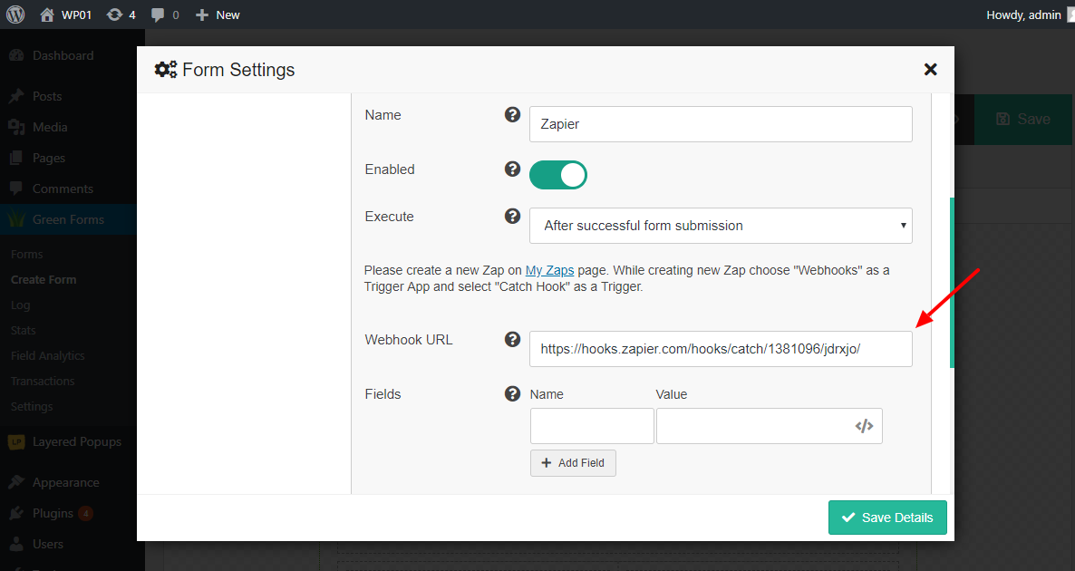
Zapier
To enable integration with Zapier, make sure that you activated appropriate integration module. Go to Advanced Settings page and turn on Activate Zapier Integration module. Then go to form editor, click button on Top Toolbar, select Integrations tab and click Zapier button. New Zapier integration will be added. Click to configure integration.
It has the following parameters:
- Name. The name of the integration. It is used for your convenience.
- Enabled. You can disable this integration by turning this off.
- Execute. You can specify when integration must be executed: after successful form submission, when user confirmed submitted data using double opt-in feature, after successfully completed payment or after non-completed payment.
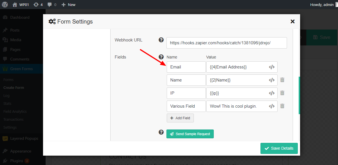
- Webhook URL. Enter Webhook URL generated by Zapier when you created new Zap. Please read below regarding creating new Zap.
- Fields. Create Zapier fields and map form fields to them.
- Conditional logic. If enabled, you can create rules to enable this integration depending on the values of input fields.
Below is a step-by-step description of integration procedure. Start with creating new Zap.
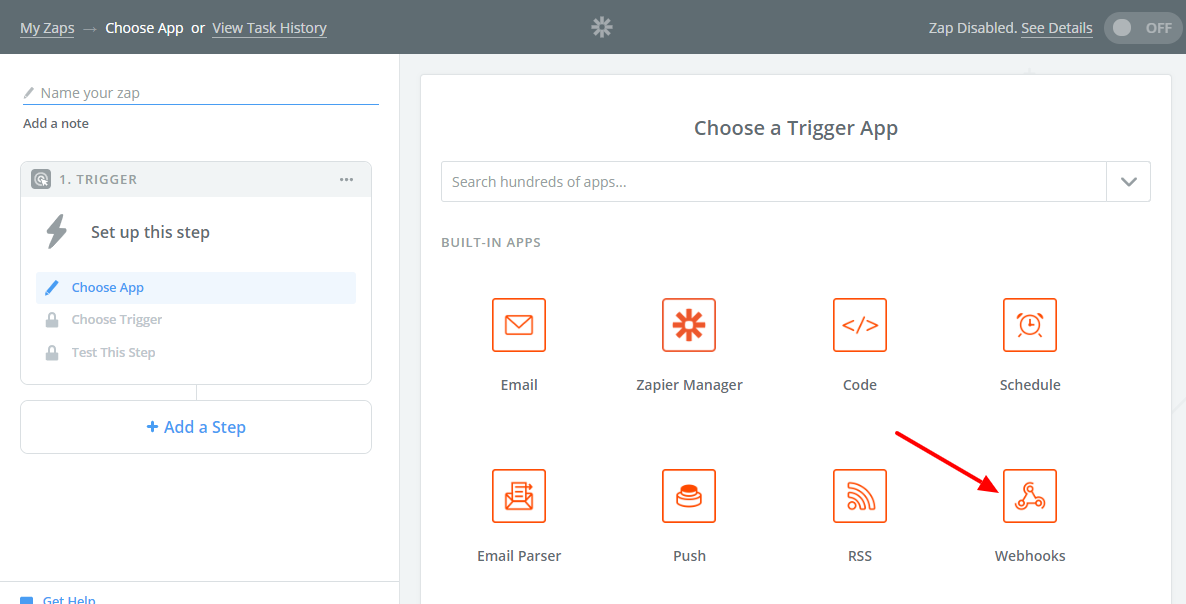
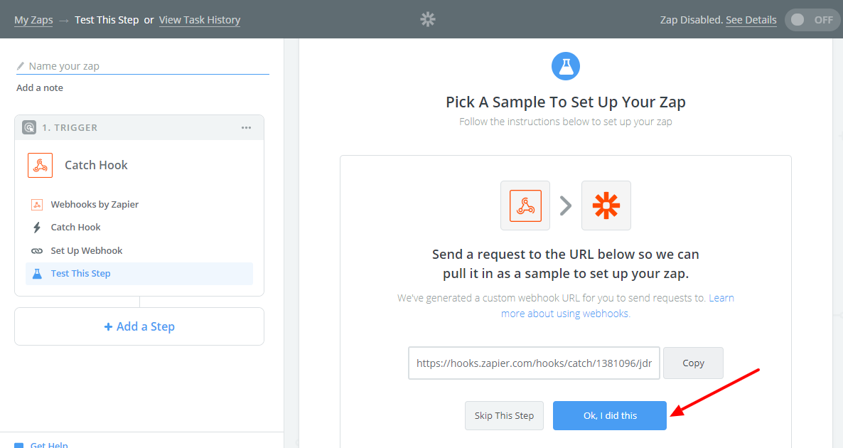
- Go to your Zapier account and click “Make a Zap!” button.
- Zapier ask you to choose Trigger App. Find built-in app “Webhooks” and click it.
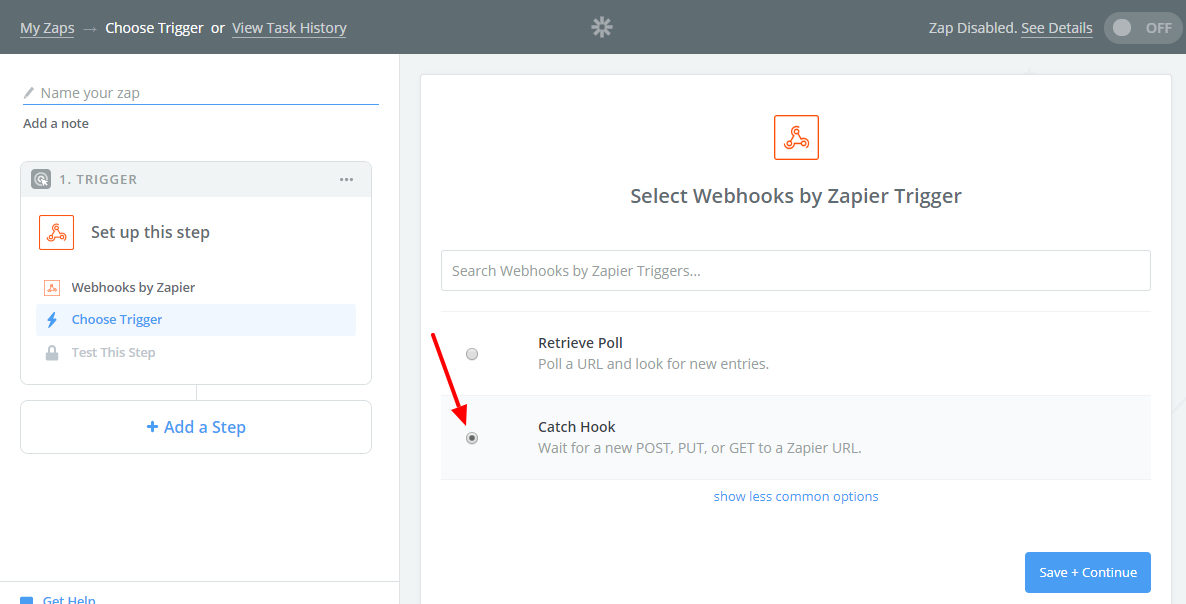
- Zapier ask you to select Trigger. Find “Catch Hook”, select it and click “Save + Continue” button.
- Zapier generate Webhook URL which you use in integration process.
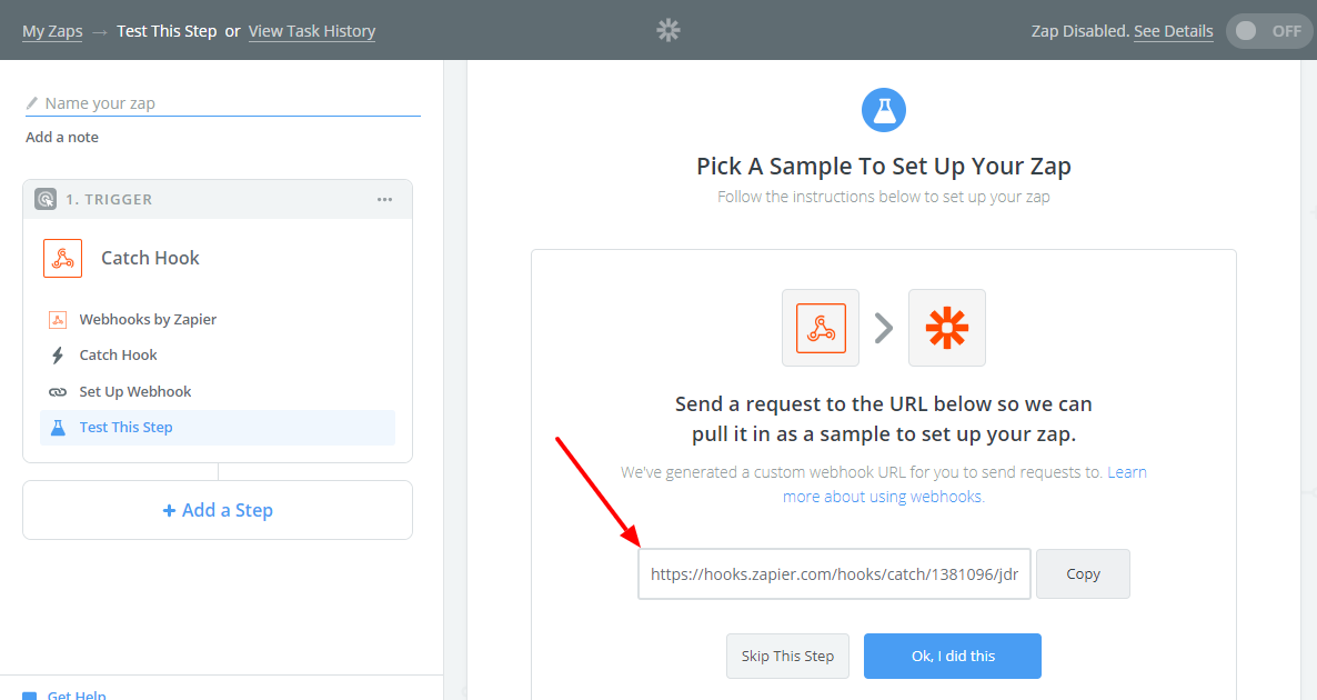
- Go to form editor, create new Zapier integration and paste Webhook URL from previous step.
- Create as many Zapier fields as you need and map form fields to them.
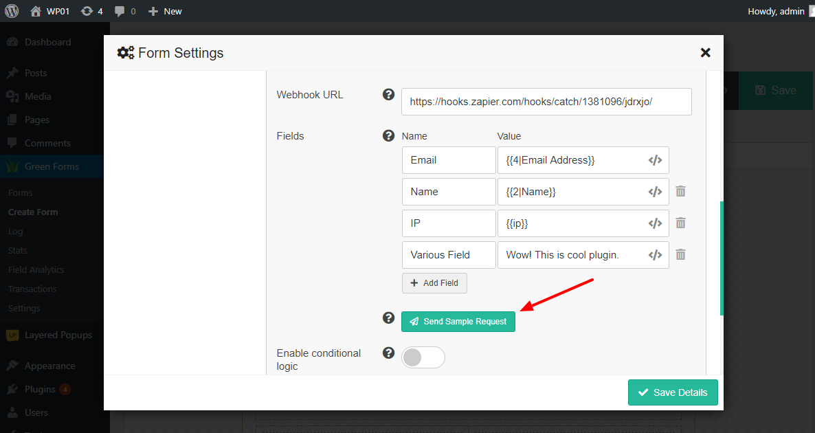
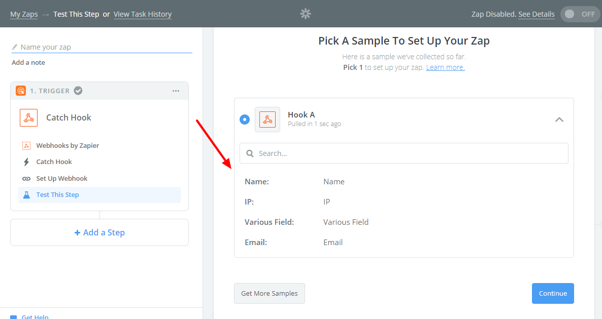
- Click “Send Sample Request” button. Plugin will send a request to the Webhook URL so Zapier can pull it in as a sample to set up your zap.
- Go back to Zapier account and continue with creating new Zap. Click “OK, I did this” button.
- Zapier show the list of fields received from the plugin. You can use them later while creating Actions for your Zap. Click “Continue”.
- Then you need create Action for your Zap. While creating Actions you can use fields received from the plugin.
That’s it. Zapier is a pretty convenient way to integrate Green Forms with over 1500 applications and services.
Zoho CRM
To enable integration with Zoho CRM, make sure that you activated appropriate integration module. Go to Advanced Settings page and turn on Activate Zoho CRM Integration module. Then go to General Settings page, find Zoho CRM Connection section and connect plugin to your Zoho CRM account. After successful connection go to form editor, click button on Top Toolbar, select Integrations tab and click Zoho CRM button. New Zoho CRM integration will be added. Click to configure integration.
It has the following parameters:
- Name. The name of the integration. It is used for your convenience.
- Enabled. You can disable this integration by turning this off.
- Execute. You can specify when integration must be executed: after successful form submission, when user confirmed submitted data using double opt-in feature, after successfully completed payment or after non-completed payment.
- Fields. Map form fields to Zoho CRM fields.
- Conditional logic. If enabled, you can create rules to enable this integration depending on the values of input fields.
To enable integration with 3rd party HTML form, make sure that you activated appropriate integration module. Go to Advanced Settings page and turn on Activate HTML Form Integration module. Then go to form editor, click button on Top Toolbar, select Integrations tab and click HTML Form button. New integration will be added. Click to configure integration.
It has the following parameters:
- Name. The name of the integration. It is used for your convenience.
- Enabled. You can disable this integration by turning this off.
- Execute. You can specify when integration must be executed: after successful form submission, when user confirmed submitted data using double opt-in feature, after successfully completed payment or after non-completed payment.
- HTML form. Copy-paste HTML-code of 3rd party form and connect it. Important! It must be pure HTML-form with
<form> tag, but not javascript/iframe-driven form.
- Fields. Map form fields to 3rd party form fields.
- Client side. Enable this option if you want form to be submitted from client side. Otherwise, it is submitted from server side. Please read paragraph below regarding using this feature.
- Target. Select where to display the response that is received after submitting the form. This feature is only available, “Client side” enabled.
- Conditional logic. If enabled, you can create rules to enable this integration depending on the values of input fields.
Pay attention to some combination of parameters. Some of them won’t work.
"Execute" is "after successfully completed payment" and "Client side" is enabled. Client side is not involved into notification about successful payment received from payment provider."Execute" is "after non-completed payment" and "Client side" is enabled. Client side is not involved into notification about non-completed payment received from payment provider.
Custom GET/POST-requests
To enable sending form data to 3rd party URL using GET or POST requests, make sure that you activated appropriate integration module. Go to Advanced Settings page and turn on Activate Custom GET/POST Integration module. Then go to form editor, click button on Top Toolbar, select Integrations tab and click GET/POST button. New integration will be added. Click to configure integration.
It has the following parameters:
- Name. The name of the integration. It is used for your convenience.
- Enabled. You can disable this integration by turning this off.
- Execute. You can specify when integration must be executed: after successful form submission, when user confirmed submitted data using double opt-in feature, after successfully completed payment or after non-completed payment.
- Type. Select the type of the request: GET or POST.
- URL. Enter URL to send GET/POST-requests to.
- Query parameters. Create query parameters and map form fields to them.
- Conditional logic. If enabled, you can create rules to enable this integration depending on the values of input fields.
3rd party MySQL database/table
To enable inserting form data into 3rd party MySQL database/table, make sure that you activated appropriate integration module. Go to Advanced Settings page and turn on Activate 3rd party MySQL Integration module. Then go to form editor, click button on Top Toolbar, select Integrations tab and click MySQL button. New integration will be added. Click to configure integration.
It has the following parameters:
- Name. The name of the integration. It is used for your convenience.
- Enabled. You can disable this integration by turning this off.
- Execute. You can specify when integration must be executed: after successful form submission, when user confirmed submitted data using double opt-in feature, after successfully completed payment or after non-completed payment.
- Current connection. Enable this option if you want to use current MySQL-connection (MySQL-server and database).
- Hostname. Enter your MySQL server hostname.
- Port. Enter your MySQL server port. Leave it empty if you do not know the port or it is standard 3306.
- Username. The username must have sufficient privileges to access MySQL-server and database.
- Password. Enter password for MySQL server user.
- Database. Enter MySQL database name.
- Table. Select desired Table.
- Columns. Map form fields to MySQL table columns.
- Conditional logic. If enabled, you can create rules to enable this integration depending on the values of input fields.
Create new WordPress user
To enable creating new WordPress user, make sure that you activated appropriate integration module. Go to Advanced Settings page and turn on Activate WP User Integration module. Then go to form editor, click button on Top Toolbar, select Integrations tab and click WP User button. New integration will be added. Click to configure integration.
It has the following parameters:
- Name. The name of the integration. It is used for your convenience.
- Enabled. You can disable this integration by turning this off.
- Execute. You can specify when integration must be executed: after successful form submission, when user confirmed submitted data using double opt-in feature, after successfully completed payment or after non-completed payment.
- User role. Select the role for the newly created user.
- Fields. Map form fields to WP User fields. You can map the following fields: email, password, first name and last name.
- User notification. Email login credentials to a newly-registered user (standard WP message). This option should be enabled if you did not request a password from the user.
- Allow updates. Update user data for already existing users. Existing user must have the same user role.
- Conditional logic. If enabled, you can create rules to enable this integration depending on the values of input fields.